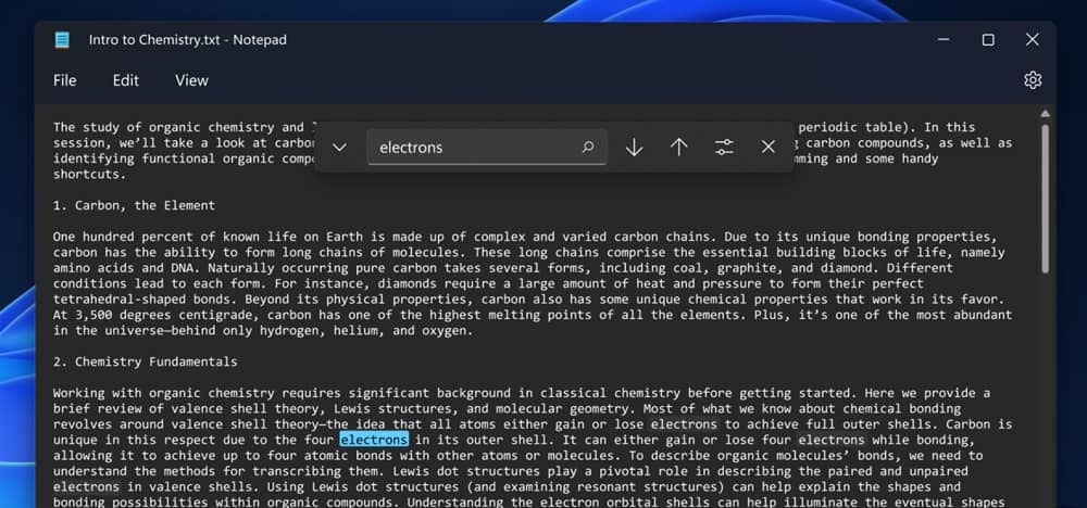
But now, in Windows 11, we can see a new design for Notepad and a few features being added. As seen in Win11 latest Dev build, Notepad gets a Mica transparency background, new Find section, and Dark Theme.
Notepad in Windows 11
With Windows 11, Microsoft intended to revamp the design of most default elements of the OS. One among them is the Notepad, a generic feature for writing text and editing it. It’s used by several people for multiple jobs daily. Yet, Microsoft hasn’t cared about it in many years. But now, it’s going to change. As seen in the latest Windows 11 Insider build in the Dev channel, the Notepad app received a few new features and design changes. Notable among them is the Dark Theme, which has been a much-needed feature from the community for so long. This will be helpful for those working in low-light environments. Further, there’s a Mica transparency effect for the outer borders, that’ll blur and display the background screen. This makes it more included in the new design of Windows 11. The icon of Notepad too has been updated to look modern, and on par with other new apps. The main options above, viz File, Edit and View has been made bigger, plus a dedicated Setting button is added in the top right corner of the window. In terms of features, Microsoft replaced the old toolbar for finding elements in the Notepad, with a new ribbon that’s simple and smooth. Also, multi-level undo support is added. Previously, when you hit Ctrl + Z, you’d be able to undo the last activity, and hitting the same keys again will revert (redo) it. Now, hitting Ctrl + Z multiple times will undo the last actions in sequence.

